
Should you follow the trends or not?
It’s funny how colors affect our mood. And how some people can love a color while others dislike it. It was announced that Pantone’s color of 2024 is Peach Fuzz. For me that is a big NO. Having bought my first house in the 80’s, I lived through the Peach, Blue, Rose and Seafoam Green trend. Been there, done that. Now there is a new generation of home buyers that will embrace the color. Trends can be fun, I have definitely followed a few in my time. However, as I’ve gotten older I’ve found my own style, what makes me feel cozy and comfortable. I choose colors that I like and that make me feel good. My choices may not be what others like but that’s ok. Do what makes you happy-It’s your home! Now it’s a different story if you are getting your home ready to sell, then color does matter. Neutrals are best at that point but that’s another topic. Embrace your own style!
I found this interesting. Here’s a breakdown of some common colors and their psychological effects in home design:
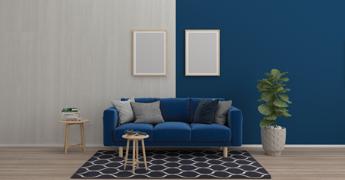
Blue
Psychological Impact: Blue is often associated with calmness, tranquility, and serenity. It can create a sense of peace and promote relaxation. Lighter shades of blue are soothing, while darker blues can convey a sense of depth and stability.
Application: Ideal for bedrooms, bathrooms, or areas where relaxation is desired.
Red
Psychological Impact: Red is a bold and energetic color associated with passion, excitement, and warmth. It can stimulate conversation and increase energy levels. However, too much red can be overwhelming.
Application: Use as an accent color in areas where social interaction is encouraged, such as dining rooms or living spaces.
Yellow
Psychological Impact: Yellow is often linked to happiness, positivity, and energy. It can bring warmth and light to a space. However, intense yellows may be too stimulating and should be used carefully.
Application: Suitable for kitchens, entryways, or spaces where a cheerful atmosphere is desired.
Green
Psychological Impact: Green is associated with nature, growth, and harmony. It has a calming effect and is often considered restful for the eyes. It can promote a sense of balance and well-being.
Application: Ideal for bedrooms, living rooms, or spaces that benefit from a connection to nature.
Purple
Psychological Impact: Purple is often associated with luxury, creativity, and sophistication. Lighter shades can evoke a sense of calm, while deeper purples can add a touch of opulence.
Application: Suitable for bedrooms, offices, or areas where a touch of elegance is desired.
Orange
Psychological Impact: Orange is a vibrant and energetic color associated with enthusiasm and warmth. It can create a welcoming and social atmosphere. However, too much orange may be overly stimulating.
Application: Use as an accent color in areas where energy and social interaction are encouraged.
Neutral Colors (Gray, Beige, White)
Psychological Impact: Neutral colors are often associated with simplicity, sophistication, and versatility. They provide a neutral backdrop and allow other elements in the space to stand out. White can evoke a sense of cleanliness and purity.
Application: Suitable for a variety of spaces, including living rooms, bedrooms, and kitchens.
Brown
Psychological Impact: Brown is often associated with stability, security, and comfort. It provides a grounding effect and can create a warm and inviting atmosphere.
Application: Suitable for living rooms, bedrooms, or areas where a cozy and comfortable ambiance is desired.
What do you think? Do you agree with this? What colors speak to you? I would love to hear your thoughts.
Read more about The Power of Color Psychology in Interior Design. (Medium.com/Flow Interio)
Ready to become a homeowner? I offer a FREE one-on-one meeting to help you understand the process. Let’s Chat!
Kathy Doucette Real Estate
[email protected]
612-716-5910